When creating a restaurant concept, the stage I look most forward to is design. We’re not designers but instead we get to work with different designers across the country – usually chosen by the client. Each designer has their own collection of superpowers, non-negotiables, and pet peeves. During design phases (kitchen, architecture, and design) our primary focus is on efficiency, throughput, menu execution, and profitability. Together we arrive at 2D drawings…and generally speaking, I’ve never met a 2D drawing that I didn’t like. They’re so clean and puzzle-like. You can move things around and test guest experience philosophies. Operators and owners can surprise everyone with left-field epiphanies that no one ever considered. It’s very satisfying to get to this phase of a concept’s life as all the talk and spreadsheets begin to look like a restaurant.
A mid-to-late part of the “drawings” process is the reflected ceiling plan (RCP). Here you see gang box placement and electric flow showing the schematic location and type of lighting the designers have cooked up. It’s like a cherry on top. If the client is paying for it, designers will also generate some 3D renderings showing furniture, lighting, and maybe even drag in some ultra-fit human silhouettes. It’s at this moment… after many decisions have been made…close to the point of no return…that instinct says, “hmmm…something isn’t right”. But the focus is usually on the furniture and the bar and the fabrics and the colors and the silhouettes. The lighting is tough to see as the rendering shows a lit room but can never quite capture the difference between warm and cold lighting. Overhead fixtures are often dramatic and have been picked over so many times for their aesthetic appeal but the quality, angle, and interplay with other lights often get barely any mention. Lighting choices may draw fire from the renderings but, again, usually only for their aesthetic, not for the light that it puts out. Does it create unintended shadows? Is it dimmable? Does it affect the artwork? Does it effectively light a path, if that’s what it is supposed to do? Does it clash with the plates or glassware? Does it make people look less attractive or, by effectively lighting one area unintentionally blind someone at another table or at the front door? When the restaurant opens it looks exactly like the renderings…but its then that you realize what it was that bothered you. The live version is sterile or lacks soul. And it’ll be too late (and expensive) to change it. Ignore it at your own peril.
I had the joy of working with Phil Romano (as in Romano’s Macaroni Grill) on his eatZi’s Market & Bakery concept many years ago. Mr. Romano was an aesthetics champion believing many things about design …and especially lighting. We had several opportunities to eat at his home in Dallas which was more of an art museum than a home. He had an original (or two) Jackson Pollack and plenty of other original works by artists I’ll never remember…but I’ll always remember his impeccable lighting. I don’t quite remember the fixtures themselves, but I do remember how the light worked. He had unique ceilings in every room, and they immediately jumped out as such. The artwork jumped off the walls, off his desk, and off his vast kitchen cooking island which was, itself, art. Walking through his house – even if just to use the restroom – was like walking through a fine Parisian restaurant. Everything he wanted his guests to see, they could see. And, I assume, everything he didn’t want to showcase, we couldn’t wee (I guess…because I didn’t see or remember seeing them).
Lighting in a restaurant can take a beautiful 2D layout with beautiful furniture and wall treatments and artwork and destroy it with one or two poorly chosen fixtures. Lighting can make a restaurant’s food and guests look magnificent or inedible and ugly (assign those freely). If you’ve recently stayed at a modern hotel, you’ll know what I mean as their LED fixture and bulb upfits were chosen to cut their power bills, not so you can feel at home in your room. Around Christmas time at Home Depot, the section with incandescent string lights is always sold out and you can still get whatever LED variety you want until December 24. We like incandescent lights because they are warm, and they make everything look better than LED can. While the bad news is that incandescent lights are becoming obsolete, as a green initiative, the good news is that manufacturers are getting better at making incandescent-like bulbs.
There are many aesthetic elements that make up a guest’s experience, but lighting is in the top two. Here is my simple list of restaurant lighting philosophies (pulled my collection of Phil-isms and many other designers we’ve worked with over the past 16+ years) that I live by when collaborating on restaurant design:
- Light filaments should never be seen. They burn the retina and managers often fail to consistently dim Edison style bulbs enough to make up for the horror of having your retina burned by it.
- Track lighting should only point up. There is nothing worse than track lighting pointing down on a table or across the room SOMEONE, SOMEWHERE is getting blasted by that light.
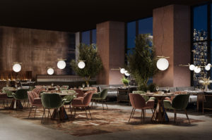
- Tables should glow…faintly. Recessed pin lights from the ceiling can help but they cannot replace a warm candle or soft light at a table for making guests look beautiful. Faces lit from low to high are more beautiful than faces lit from the top down.
- Bar lights need to be low enough and dim enough to make bar patrons attractive (good lighting can make anyone look 2-beers better) but not so low that they interfere with conversation. Personally, I love little lamps with shades sitting directly on the bar.
- Overhead light fixtures should be used for accent only and NEVER as the sole source of lighting in a dining room. Incandescent or not, overhead light DESTROYS a restaurants aesthetic almost as fast as loud bad music. Ideally, patrons won’t be able to see the filaments on little chandelier bulbs. If they can, they should be dimmed.
- Lighting for stairs and walkways should be imbedded in the stairs or walls and aimed down. The light itself is the star, not the fixture.
- Bathroom lighting should be from the sides with some coming from below.
- Kitchen lights should be can lights (rubber coated is required for foodservice area), not fluorescent. I love a good exhibition kitchen like the next consultant, but why spend all of this money on great restaurant design and dining room lightly only to pollute the entire dining room with the blast of fluorescent lighting coming from the expo window? Oy!
- Bars foot rails should be gently illuminated. Very easily done with rope lighting under the bar. It’s a touchpoint of comfort to know that you can see your feet and your purse.
- The front desk should be lit with lamps and foyer overhead light should be avoided. Sure, a dramatic fixture can set the brand message but it’s the care for the human interaction at the desk that will truly set the tone. Your front desk staff should look amazing, and their smiles should be beams of light (i.e. – from the lamp light bouncing off their exposed teeth…and don’t forget to whiten their teeth).
- If you can get a fireplace or fire pit in your restaurant with real fire, do it. If you can use real candles in neat little fixtures for your tables, do it. There is nothing like real fire to make people look and feel their best.
- The outside of the restaurant should be up lit from the landscaping. Up lighting on a building can make the ugliest building look great.
- This last one belongs in a separate conversation about signage…but it’s worth mentioning: your sign should be clean and easy to read at 35mph. It should be light copy on top of a dark background which jumps out more easily (vs. a cheap, white, backlit plastic background with dark letters). Ideally the letters themselves will be lit so they stand proud.
If you’ve read through all of this and somehow gotten the impression that you need to increase your design budget 3x to achieve great lighting, then I have done a terrible job communicating the point. If you want your customers to see the light not the light fixture, you don’t need to spend a fortune on artistic fixtures. Instead, focus on what they lights are doing and where they are pointing. And for the love of your investment don’t be hypnotized by a designer’s reflected ceiling plan or renderings.
Ray Camillo – Founder & CEO, Blue Orbit Restaurant Consulting
Blue Orbit provides hands-on partnership and unparalleled industry insight to create new concepts from the ground up and evolve ideas into maturity.
Are you ready to talk with one of our expert restaurant consultants? Contact us today and tell us about your situation and how you’d like us to help.